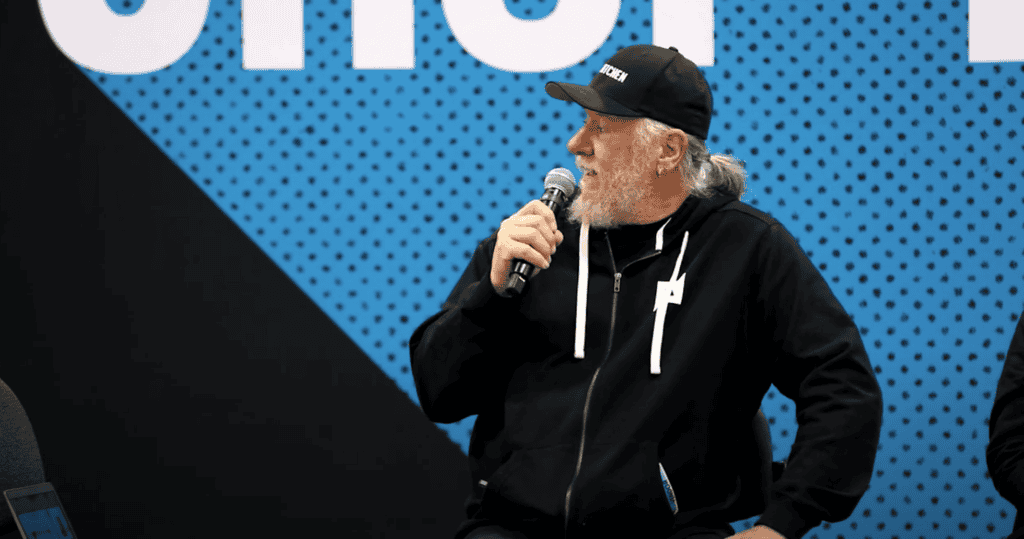
February 4th, 2010

Bad T-Shirt Design Recipes

This post isn’t going to have illustration. There are many many possible illustrations for this post, but there is no reason to hurt anyone’s feelings.

Do you want a bad looking t-shirt? Here are a few pointers:

1. Just design whatever you want and don’t think about what kind of shirt it is going on. It looks good on your screen, you want black shirts, just tell us to print it as drawn. Well… that big mostly white photo on a black t-shirt is going to be a disgusting block of white ink on a black shirt. If we use plastisol ink, that will probably make the print bulletproof and who knows, it could save your life in a firefight. However, that still won’t make it attractive. Want any ugly shirt - ignore the fabric,  and the color of the shirt, and the style of the shirt.

2.  Never mind thinking about what kind of shirt, don’t even think about it being a shirt. You want a shirt that will be worn or one that will be good for waxing cars?  Shirts are made to be clothing, not for galleries. Reproduce perfectly some attractive and maybe even brilliant graphic from an ad campaign’s billboard on a shirt, and sometimes you have a perfectly awful looking shirt.

3. Use your ignorance and  pass it off for originality – if you haven’t printed shirts you can be seduced by your computer screen to do crazy locations and too many blends. The resulting shirts are either too expensive to print or often just bad looking.  Send your printer  a mock up of the shirt and the graphic is displayed in a way that the front and back of the shirt are tied in together. The problem is that shirts are rarely ever viewed front and back at the same time and the idea is lost upon anyone but the original designer.

4. Don’t listen – When printers don’t really listen to what the designer wants or designers don’t listen to the printer’s concerns the results of such poor collaboration are unattractive, expensive, and disappointing all around.

5. Be logo police! Above all protect the sanctity of your logo, even if reproduced accurately you end up with a big ugly piece of clothing. Don’t consider putting a smaller version of your legal trademarked logo, just emblazen that inky logo with a color that is out of fashion all over the shirt. The logo works on TV and in print media, so of course it will work on clothing. I personally let my lawyer make all my fashion decisions and I recommend it for all my customers.

6. Don’t bother thinking of your customers. If you like yellow shirts personally, why not everyone? You saw a giant face with glitter and crystals at some hip shop, that’ll work for the AARP trade show as well, right?

7. Make the shirt as complicated as possible. Make sure you have lots of colors, an intricate design, difficult to reproduce graphics, and print in many locations on the shirt. Just ignore the fact that there seems to be an inverse correlation between the simplicity of a shirt and how successful it is. In music if you have more instruments or more notes it doesn’t mean that it sounds better, although it may be more distracting. The same goes for design and more ink and more complicated artwork does not necessarily make a better t-shirt.

February 2nd, 2010

Over Under Sideways Down

Rush job.

No surprise there, we do rush jobs all the time. However, usually not to go to life and death situations. We got asked on the weekend to source vests for Doctors to wear for Partners in Health in Haiti. Their shirts were getting dirty and better to have a vest and then they could be changing shirts but still be identified.

So, find “safari vests” and get them here in time to decorate and deliver an hour away on Tuesday.

My ASI Distributor (Promotional Products guy extraordinaire for Geiger) David Kenneally found some vest sources.
On Monday I hit the ground running and by noon had 300 vests at a reasonable price that could be delivered by Tuesday AM.
However, nothing like getting something you have never seen before and having to print it immediately.
The vests arrived, immediately we took measurements. We also immediately saw how big the pockets were, not something to be ascertained by looking at a photo in a catalog.

Production manager Pete to the rescue. After realizing we could not embroider them in time (our Plan B ahead of time, you always have to have Plan B and in fact should also have plan C.)

Pete figured out that we could print them sideways on a sleeve pallet. If we had tried to print them the other way, the pockets would have messed up the squeegee travel going in either up or down direction. However, sideways worked fine.

The result are vests printed front and back in a serious hurry, even with a “problem” and delivered as needed same day.

Pockets. Useful but in the way!

Pockets. Useful but in the way!


Sideways printing, with pocket out of the way on sleeve platen.

Sideways printing, with pocket out of the way on sleeve platen.

The finished vests are going to hard working Docs in Haiti, ordered, printed and shipped out in 24 hours.

The finished vests are going to hard working Docs in Haiti, ordered, printed and shipped out in 24 hours.

January 16th, 2010

A Real Emergency

I just returned on a red-eye from selling our contract printing at the PPAI show in Las Vegas. I was awakened from sleeping this afternoon by a call from the mother of a classmate of one of my kids. She was trying to find 500 orange t-shirts for doctors to wear in Haiti, they will allow the doctors to be identified. Planes are heading down there Monday with medical folks from Partners in Health that can help with the horrendous medical situation there.

The plane is going early Monday and so they needed the shirts now. As you know, shirt warehouses are not open on weekends. I had Steve Valeri’s cell, he runs NES Clothing. I called him and within five minutes he had reached his Warehouse Manager Greg who agreed to open up and grab the shirts.

It is a tiny tiny effort in what must be a herculean effort to help Haitians. Haitians needed our help before the earthquake, what they need now is almost unfathomable.

I have had customers need shirts in what they describe as an “emergency” and usually it is about making money. That all seems silly compared to what these shirts are being used for. It puts all other “emergencies” in new perspective.

Partners in Health were a major positive force in Haiti before the earthquake and they are one of the best charities in general. They are a good start in a place to send your donations to help the Haitian people:  go to PIH.org for their main page, or we set up a page to track garment industry donations to Partners in Health:

http://act.pih.org/page/outreach/view/haitiearthquake/RickRothMI

January 8th, 2010

Mother of Invention, Fun with nylon and sticks and stones

I would rather be writing about the Mothers of Invention, Frank Zappa and all that, than thinking about nylon.

We have always avoided printing on nylon, but I’m learning to embrace it. Nylon shrinks when you heat it and ink doesn’t really want to adhere to it and nobody technical gives you any consistent information, other than that it is great stuff to work with.

This tale is starts with a big problem, gets silly and ultimately has a very happy ending. I’ll tell it briefly.

Big problem to start. We print simple print on black 200 denier nylon. (Denier is a measure of thickness/weight/fiber strength that I don’t entirely understand.) Pretty thin nylon is a fair description of the piece in question. We are told that  the vendor can only accept one quarter inch of shrinkage over the length of the piece, which is not much. We then play experimentation games with the dryer and the catalyst (another blog post coming up)  until we get the ink to mostly cure and the fabric to mostly not shrink.

Great, ready to roll… except the light canvas blows around in the oven and ink gets all over the pieces. grrrrrr.  No problem, I go out back and saw up a million small blocks of wood (sticks) to hold the ends down.

Pieces of wood holding nylon from blowing around in oven

Pieces of wood holding nylon from blowing around in oven

This is a pain for the person unloading, but seems to work. However, upon closer examination it causes a problem. There is a slight mark where the wood lies. The wood doesn’t seem to be that hot or anything. Aha, actually it  shields the nylon and basically the whole panel is shrinking very slightly, but under the wood it shrinks not at all and it causes a slight pucker.

Nylon pucker caused by wood block

Nylon pucker caused by wood block

So we searched for something smaller and went from sticks to stones, literally we went out and found them in the parking lot. They were heavy enough to hold the nylon down but didn’t have a big footprint on the nylon, but they still had a little mark left on the nylon after passing through the oven.

Real high tech, stones from the driveway to hold down the nylon

Real high tech, stones from the driveway to hold down the nylon

We started looking around for what else we could weight down the nylon with and found some light metal brackets, but they left small dimples as well.

These metal pieces didn't work that well either

These metal pieces didn't work that well either

Finally, necessity if the mother of invention and somebody tried what I thought was not a good idea and folded the nylon in half and then looped the second end over as well. I thought that the blowing air in the oven would catch the openings and make things worth. However, I was wrong and I think the static holds the two loose ends in place. Whatever the reason, it works and we printed thousands of panels and they didn’t blow around any longer. We not only didn’t ruin any more panels, we didn’t cause any more marks whatsoever on the fabric, and it was faster than putting sticks or stones on the ends. Home run.

October 6th, 2009

Shirts for Change

I just attended (and volunteered at) the 24th Farm Aid concert. This year was in St. Louis, MO. Farm Aid raises money to help family farmers.

One tool in that battle apparently is the t-shirt.

Rhonda Perry of the Missouri Rural Crisis Center gave a powerful speech at the press conference before the show. She thanked the main Farm Aid supporters, Willie Nelson, Dave Matthews, John Mellencamp, and Neil Young. She thanked Neil Young for wearing a “Stop Factory Farms” t-shirt made by her organization. She said that his years of wearing it on stage during his tours almost single-handedly brought public attention to the problems of factory farms.

Besides thanking him, I think she was prompting him a bit to wear it again, and during his remarks he commented that he didn’t know why he was wearing the shirt that he had on.

We delivered a fresh Stop Factory Farms shirt to his tour bus and sure enough he hit the stage wearing it.

However, he wasn’t done with wearing his heart on his sleeve (or in this case chest.)  After a couple songs he spoke to the audience at the concert hall and on TV and ripped his red stop sign design Stop Factory Farms shirt right down the middle and it revealed a second shirt. This shirt was green and said “Go Family Farms.”

T-shirts at their best, direct and to the point, making a statement. In this case in the inimitable style of Neil Young.

Neil Young at Farm Aid wearing a "Stop Factory Farms" shirt.

Neil Young at Farm Aid wearing a "Stop Factory Farms" shirt.

Neil Young at Farm Aid a few moments later, red shirt ripped in half revealing a green "Go Family Farms" shirt

Neil Young at Farm Aid a few moments later, red shirt ripped in half revealing a green "Go Family Farms" shirt

October 1st, 2009

Sad Day

American Apparel has been a leader in trying to get meaningful immigration reform. I have been in their facility many times and nearly always unannounced, and I can tell you that they treat people well there. They work hard there, but the working conditions are good.
I think that the Mark Twain line, “Few things are harder to put up with than the annoyance of a good example” is in play here and it seems that everyone is targeting them for criticism.
The reality is that they have had literally thousands of jobs for mostly poor latinas right in Downtown Los Angeles.
This is a sad day because they are being targeted for their outspoken criticism of immigration laws, not for any mistreatment or exploitation of “illegal” immigrants.

American Apparel immigrant workers were fired today. A sad day.

American Apparel immigrant workers were fired today. A sad day.

September 30th, 2009

Fast and Faster

Smart partners that are savvy about getting things done are truly amazing. Anvil and Hanes were that today.

Yesterday at 6PM we realized that we didn’t have enough tags to finish tagging some organic t-shirts that Anvil so generously donated to Farm Aid. I called Anvil and they had them printed and overnighted by UPS in time for us to not miss a beat this morning. Got that, not just sent, but at 6PM were able to have them printed and sent? Amazing. and this is for a charitable event that helps family farmers.

Anvil Organic Shirt Donated to Farm Aid with tag that miraculously was printed and delivered overnight.

Anvil Organic Shirt Donated to Farm Aid with tag that miraculously was printed and delivered overnight.

We are printing shirts at the New Orleans SGIA show next week. Turns out for some big musicians and for demo of a new big format MHM press we needed some really big shirts. It all came down last minute. I called them this morning and XXXXXXL (that’s six x’s, really damn big) shirts are already on the road in time for the show early next week. And again this is all going for charity, for the benefit of another great charity, the New Orleans Musicians Clinic.

A box of XXXXXXL Hanes Beefy T's soon to be worn by some big New Orleans Musicians

A box of XXXXXXL Hanes Beefy T's soon to be worn by some big New Orleans Musicians

Good works done fast, sometimes things work well with people that know how to get things done.

September 4th, 2009

Discharge Ink on Two Ply Fabric

Discharge is an ugly sounding process.
Of course most discharge inks are kind of an ugly business.
However, that is another story.

Printing Edun Scarves that are two ply with discharge ink

Printing Edun Scarves that are two ply with discharge ink

The basics of discharge are that instead of covering up the darkness of a shirt with a couple of coats of ink, the discharge ink “neutralizes” the dye in the shirt. It isn’t bleaching, but it seems something like that. It is a water-based ink and has a soft hand after printing. Mostly it is used to get these soft results.
However, there are some other reasons to use discharge.
We are printing a job today for the fair trade company Edun. This is a scarf which is pretty popular for Edun, partly because U2’s singer Bono wore one at the Obama inauguration festivities.
These are dark colored scarves and normally with plastisol inks you might print an underwhite and an overwhite and be done with it.
However, these scarves are two-ply. They have two layers and the problem is that if you printed an underwhite and went to print an overwhite then the scarf might move and it would go out of register and ultimately make a mess.
Usually in printing you lightly tack (glue) down the shirt, scarf or whatever fabric and print it as many times as you want and it stays in place. However, in this instance you would be only gluing the bottom layer and the top would move and the words on the scarf would get blurry and we can’t have that.
Discharge ink allows for one pass and so solves this problem.

August 4th, 2009

Its not the heat its the humidity

Today I am too hot and its too humid to put a big effort into the blog. Just kidding. Well not really, it is very hot and humid here in Rhode Island today. Nothing like New Orleans or places, but hot enough.
Workers don’t like the heat and the humidity and neither do screens. I did some research and we have some practices in my shop, but I’ll start with some advice from Dave Dellinger from KIWO because I can’t say it any better, although I paraphrase a bit:

?After coating, your screens must be kept dry. 30 to 40% relative humidity is ideal, and never exceed 50%. Too much moisture left in the emulsion and you will have improper exposures and incomplete cross-linking (emulsion curing.) So you will get the following problems as a result of screens that aren’t “dry.”
- Pinholes develop while printing
- Emulsion becomes soft and tack
- Reclaiming becomes more difficult
- Ghost/haze images after reclaiming become more of a problem

Using an hygrometer (fancy name for a thing you buy in a hardware store to measure humidity) is essential. The emulsion can feel dry to the touch, but it is not. Only measuring is accurate.

You can even dry your screens very well in a closet that is heated and vented, or it may have dehumidifiers or any number of great ways to get the humidity out. However, if the storage area (i.e. usually a closet or a stack in the screen room) is humid, the water will go back into the screen and “rehydrate” the emulsion. This is a bad thing and leads to all those nasty problems we mentioned before.

So measure the humidity and if too high, get rid of it. Vented fans are great to get rid of the large amounts of water, for instance from the closet doing the initial drying of your emulsion or from around your sinks.

Beyond that, it is air conditioner or dehumidifier to get rid of moisture. Basically a dehumidifier gets rid of water into a container or a hose and in doing so just sends the hot air back in the room. An air conditioner sends the water outside either dripping or evaporating and sends the hot air outside and the cool air back in.

If it is really humid outside, an air conditioner might have to cool a room down to fifty degrees (brrrrr!) to get rid of enough moisture to bring your humidity down below 50%. Some units even have a reheater to make the room bearable as the AC keeps running. A better balance is probably to have dehumidifiers and AC. Run the dehumidifiers and when they can’t keep up or it is too hot, put the AC on as well.

And one last piece of advice - make sure the dehumidifier has air flow around it. I’ve seen shops put it in the screen closet in such a way that it is dehumidifying about six inches around it since no air can get to it.
Stay dry.

June 30th, 2009

Roses are red…


We are reminded today of the wonders of the Pantone Matching System. As we less and less deal with each other face to face, we need tools to communicate at a distance. One thing very difficult to communicate is the most visual of things, color.

Is this violet?


Violet?

Violet?

Is this violet?


Violet?

Violet?


We just finally settled on half-price on an order for a customer that wanted “violet” colored shirts. In our industry, violet colored shirts like the UConn shirt above, are a shade of purple. However, this customer wanted them the color of violets, which as the saying goes, “violets are blue.”

She was wrong but I don’t have the time or money to fight a small bill with someone like this.

I already was on my guard for certain colors that have a tremendous range of what people understand them to be. Avoid the words for colors Burgundy, Jade, Teal, Aqua and Gold. Burgundy can by dark purple all the way to red in people’s mind’s eye. Teal can be green, blue, or blue/green as can aqua or jade. Gold can be metallic gold, yellow, or almost orange to some folks. Now I add “violet” to that list.

Look up “violet” at wikipedia and you will see a very wide range of colors that can be called “violet.” There are about ten technical definitions of violet that range from blue to purple and even to not visible, and that doesn’t even start to deal with what some customer off the street is thinking when she uses the term.

When talking about garment or ink colors, the best thing is to show people the color. Do that under fluorescent, incandescent, and outdoor lighting if you are really worried about communicating precisely.  Send people a swatch or a sample of the color. Ask the customer what you are matching to so they can supply you with sometthing to match to. Or use the Pantone method of communicating color.

The Pantone Matching System (or painful acronym PMS) is the only way to communicate color information quickly. Most people even vaguely involved in artistic endeavors have a Pantone book. Most will not have a textile version of Pantone colors, but they will have the offset book of Pantone colors.  Make sure your customer is looking at an actual Pantone book, not at a computer screen that would be rarely color calibrated and therefore can be way off. Make sure you say C or U (coated or uncoated.) Make sure the Pantone book is fairly new and thereby not faded. Make sure you point out to the customer that C or U are referring to coated and uncoated paper stock, not to t-shirt material, and definitely not to translucent inks. There are even more traps with color, but we’ll get into that tomorrow as we head into the world of metamerism.

I’m tempted to end with a limerick, but I won’t.