I’m not sure who will win the world cup, though in my pool I’m doing pretty well so far with the Netherlands and Chile.
Brazil may have a great team, but I’m disgusted by the horrible police brutality going on in Brazil around the World Cup.
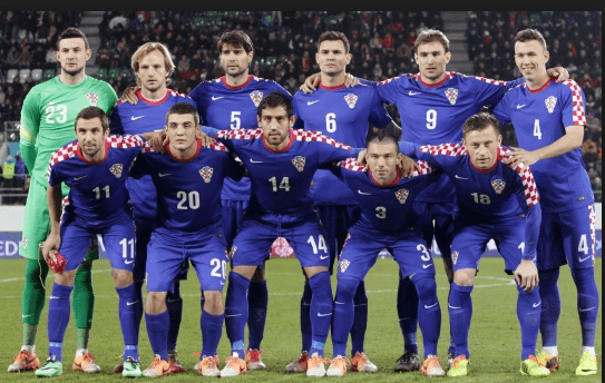
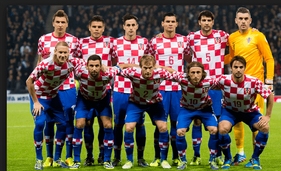
However, thoughts today are on neither of those things, I turn instead to my world, the garments. Most of the jerseys are pretty straight ahead, big bold colors in the national colors. Two national jerseys stand out, one good and one bad. Mexico has a pretty cool lightning looking jersey (though, adidas does your damn logo really have to be the most prominent thing on the shirt?), and Croatia has a hideous jersey that looks like it was designed from a reject tablecloth. It isn’t a misprint in the technical sense, but design-wise I have to give it a red card.
Who wins the World Cup in terms of jerseys and who is booted out in the qualifying round? Comments welcome.


Comments