This post from a five years ago still rings true.
The other day somebody was talking about “teal” as a color which can be everything from a bright blue to a very green blue. Here’s about colors that can be a trap if you are not careful. We are reminded today of the wonders of the Pantone Matching System. As we deal with each other face to face less and less, we need tools to communicate at a distance. One thing very difficult to communicate is the most visual of things, color.


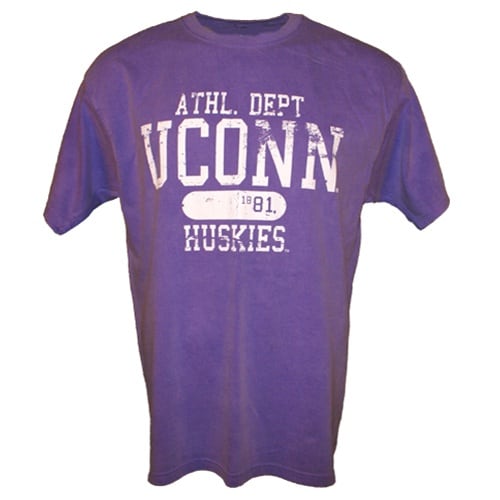
We just finally settled on half-price on an order for a customer that wanted “violet” colored shirts. In our industry, violet colored shirts like the UConn shirt above, are a shade of purple. However, this customer wanted them the color of violets, which as the saying goes, “violets are blue.”
She was wrong but I don’t have the time or money to fight a small bill with someone like this.
I already was on my guard for certain colors that have a tremendous range of what people understand them to be. Avoid the words for colors Burgundy, Jade, Aqua and Gold. Burgundy can by dark purple all the way to red in people’s mind’s eye. Teal can be green, blue, or blue/green as can aqua or jade. Gold can be metallic gold, yellow, or almost orange to some folks. Now I add “violet” to that list.
Look up “violet” at wikipedia and you will see a very wide range of colors that can be called “violet.” There are about ten technical definitions of violet that range from blue to purple and even to not visible, and that doesn’t even start to deal with what some customer off the street is thinking when she uses the term.
When talking about garment or ink colors, the best thing is to show people the color. Do that under fluorescent, incandescent, and outdoor lighting if you are really worried about communicating precisely. Send people a swatch or a sample of the color. Ask the customer what you are matching to so they can supply you with sometthing to match to. Or use the Pantone method of communicating color.
The Pantone Matching System (or painful acronym PMS) is the only way to communicate color information quickly. Most people even vaguely involved in artistic endeavors have a Pantone book. Most will not have a textile version of Pantone colors, but they will have the offset book of Pantone colors. Make sure your customer is looking at an actual Pantone book, not at a computer screen that would be rarely color calibrated and therefore can be way off. Make sure you say C or U (coated or uncoated.) Make sure the Pantone book is fairly new and thereby not faded. Make sure you point out to the customer that C or U are referring to coated and uncoated paper stock, not to t-shirt material, and definitely not to translucent inks. There are even more traps with color, but that can be for another day.
I’m tempted to end with a limerick, but I won’t.


Comments