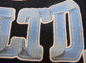
People often ask me what my favorite print is. That’s a doozy of a question but the one that brought me the most satisfaction was this one.
It was designed so that the type was a continuous ribbon. The trick was to get the high part of the ribbon a little lighter, and the shadows soft and realistic.
The answer to the shadow trick was to use a 95% base to 5% black pigment mix. It’s soft and subtle enough to pull off realistic shadows.
The highlight was a little trickier. Originally I tried a pull ink one shade lighter than the base blue but the halftones were visible and the transition wasn’t subtle enough.
Thats when it hit me… print white puff UNDER the blue leaving it wet on wet so the white will wick into the blue slightly, lightening it and naturally blending any halftones.
I’d say the effect is a pretty damn good one!


Comments