I’ve been looking closely at shirts for 43 years (I just posted about that.) Someone may say a design is cute, interesting, funny, awesome or any positive attribute and the first thing I see instead is that it is printed (in order of how often it occurs) out of registration, too low, with too much ink, crooked, off center, or with dye migration. To whatever poor bastard is with me, usually my poor wife, one of my children, or a friend they have to hear not only about what I see wrong with it, but also an explanation of why it happened.
I have unfairly picked on a few designs I just found on the internet quickly. Actually this came up because I saw a guy in a red sweatshirt at the Doctor’s office today. The red of the hoodie had bled badly into the white ink, making for a terrible looking pink print. I wasn’t feeling like getting punched in the head, so I did not get a photo of the screwed up shirt.
This incident reminded me of when I was as Hattie B’s Hot Chicken in Nashville. They had great food and cool shirts, except they had red shirts where the white ink had turned pink. I ended up pointing it out to the woman at the counter who agreed with me and said she would give my card to the owners.
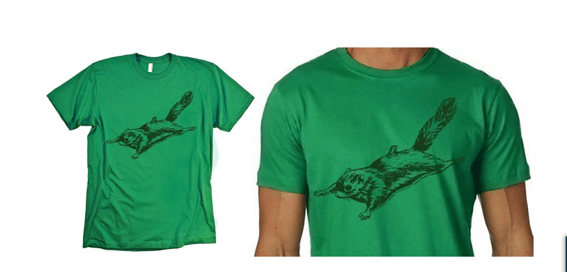
The flying squirrel shirt is very cool. However, it looks to me that they measured where they design should be placed based on the top of the design, and it ended up printed too low. You can’t take measurements only as where to put designs, visually that tail is not really where the eye goes to see the top. Secondly, avoid like hell having the main part of the shirt on the stomach, as it either fails to flatter by pointing out the non-flattering belly or can in this case probably also end up under your average woman’s boobs. I grabbed this design in haste, it is far from terrible and far from the worst of what I see out there in the world.
In a quick search for shirts I did not find my most commonly seen error, bad registration, but it wasn’t hard to find some other issues, dye migration, printing that is too low, and type that is not printed straight.


Basically I can’t help but see any issues with shirts I look at and I know that other printers are the same. Luckily the public doesn’t care a fraction of what we care or we would get a whole lot more shirts returned.

Comments