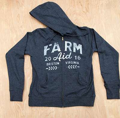
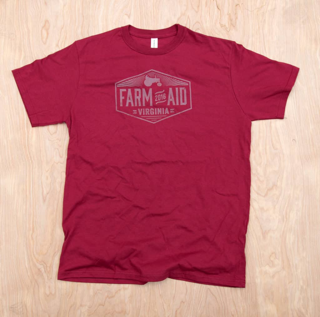
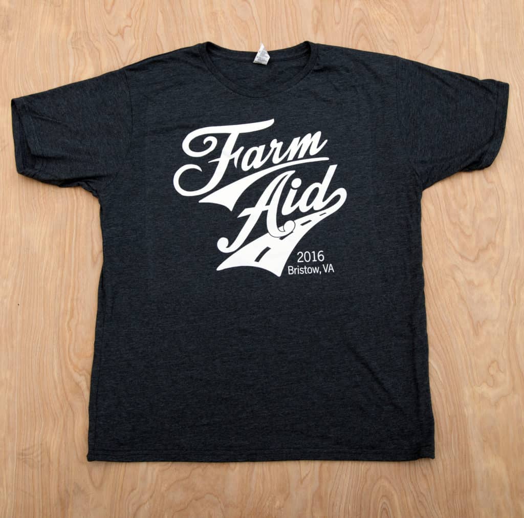
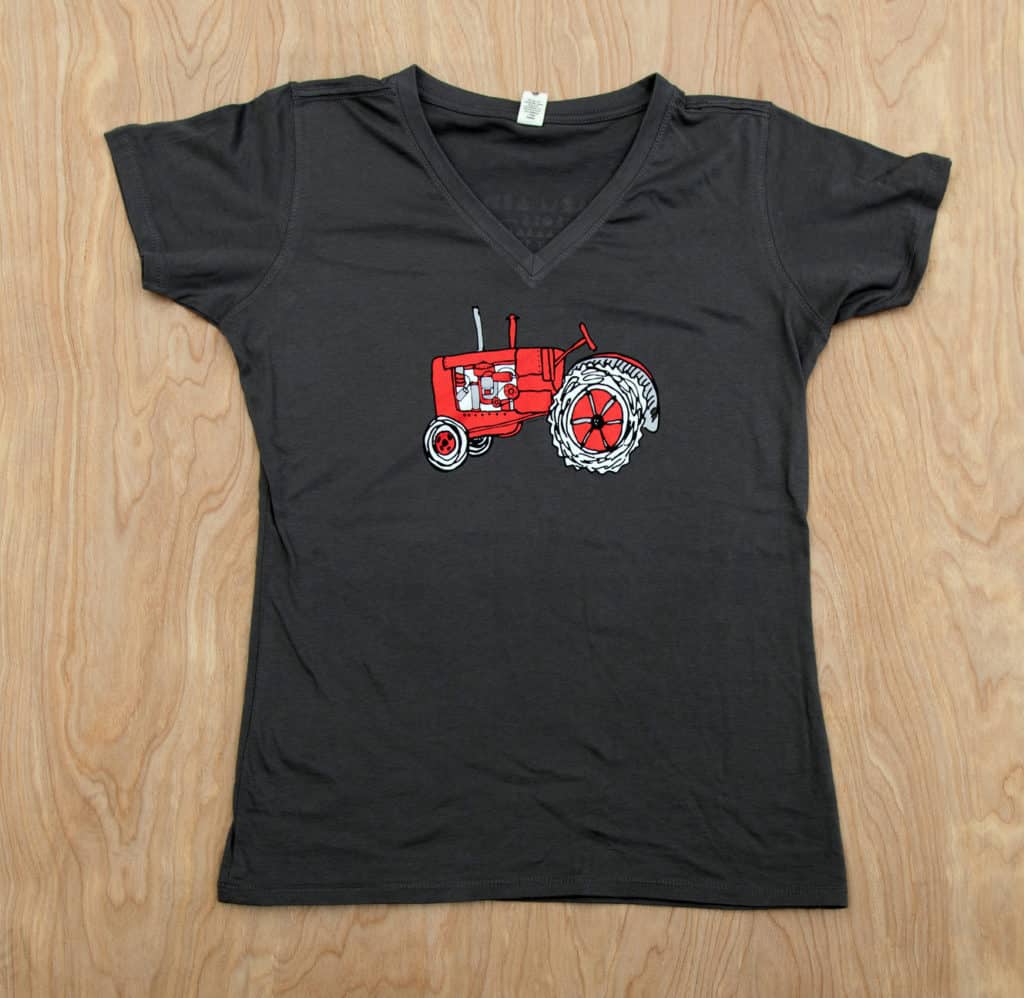
One of the Mirror Image artists and I stood in the middle of the crowd at Farm Aid. As many of the 20K people in attendance filed past us, we took note of what they were wearing. Simple, simple and simple was the conclusion. What did we see? One color designs for the most part, distressed, tone on tone, and even with “bright” colors of ink like teal and orange but that were screened back and subtle. Our company has 16 color presses and we have done some of the most complicated prints with difficult color separations and all kinds of specialty inks, but what people want right now are simple designs done well.
This re-inforced what we had decided going into the Farm Aid show. We were definitely on the right track as we sold every last shirt we brought to the show to sell. I have been doing the merchandise for over 20 years for Farm Aid (farmaid.org) concerts and this was the only time we sold out. Some things were gone in a matter of a couple hours and we had lines of thirty people or more until we ran out of shirts.
Here’s the line-up, all but the concert logo were designed with the idea that simple is better. All the shirts were printed as softly as possible. “Simple” doesn’t mean “easy” and I have to say that our artists came up with lots of concepts, narrowed to a few, and then worked these over to make subtle changes that improved each and every one of the final prints. In the end you can think whatever you want, but the proof is that they all sold extremely well.
![]()
![]()
Nice work, Rick. I totally agree on simple is best. All the multiple colors do (for everyday brands) is confuse, add weight, and add cost. Keep up the good work!
Can you tell us how you get this effect?
Graphics, screens, inks?
Mostly it is in the artwork, we use a variety of distressed filters. However, the ink, screens, and printing technique are also important for a soft print with this look.
When clients ask what designs are the bestsellers, I tell them they are 1-2 color simple prints. The prints we are most proud of, as printers, are usually not the best sellers.
I absolutely agree! Some of our toughest prints have been for designs I would never personally wear and in some cases that nobody really wants to wear.
They look great. We print 40,000 shirts a month for our subscription box services and everything I watch an unboxing on youtube, the 1/2 colour prints get the best reaction.
What brand is the Hoodie…?