
Screenprinting Page 2

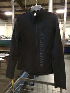
Printing $100 Garments

As a contract decorator taking responsibility of your customer’s product can be nerve-racking, especially when the numbers are big or the per piece price is high.  And of course high-end products always have a high-end difficulty factor.  We recently ran a print on some very pricey jackets by Lululemon.  Aside from taking our time to…

What Are We Matching?

Make sure you know what you are matching when a customer has many other printed items. The file you are working from may have color indications, but if the customer has already printed brochures (well, maybe back in the days when dinosaurs ruled the earth…,) billboards, beer cans, boxes, … whatever, you had better fall…

Misprint Monday – Clean Bill of Health in the Netherlands

A few notes while passing through the Amsterdam airport and looking at shirts. I don’t know about the rest of you in the business but before I can even think of how clever (or not) a shirt might be, my eyes automatically scan it for being out of register, dye migration, off the mark right…

TBT – Roses are still red… Color traps.

This post from a five years ago still rings true. The other day somebody was talking about “teal” as a color which can be everything from a bright blue to a very green blue. Here’s about colors that can be a trap if you are not careful. We are reminded today of the wonders of the…

Mike T – More Shirt Illustration. Less is More.

As our previous posts (Web Wednesday–Mike Thompson, How to Illustrate for Shirts) indicate, Mike T is the master of t-shirt illustration. Here are two more from his canon: Jam Master Jay – great use of the black shirt to blend the illustration into the background. Tupac – Limited color palette but still getting the job…

#TBT- Lenticular Screen Print

In August of ’96, I was waiting at a bus stop in the old downtown section of Prague. Across the street there was an unusual billboard. It was made up of vertical slats with different images printed on each side of the slat. The images were divided in such a way that you could only…

Throw Way Way Back Thursday

This screen is the first frame I made for the first commercial job I ever did, for Ken Brown Designs.  The image is from an ad from an old joke catalog, for some weird ass face paint. I exposed the image with a 150 watt light bulb and a pie plate reflector. Instead of a…

In the shirt, on the shirt, above the shirt.

TBT Hail Thursday! Old post on depth in screenprinting. Digital is all well and good, but screen printing is deep man. Screen printing has depth. This is a great shirt to illustrate the point. Notice the grey area, that is curable base, no pigment. You can also use very low pigment percentages up to 15%…

Throwback Thursday – Organic ink!

Mirror Image makes and prints an ink for t-shirts that is organic and so safe you can eat it.

No more pages to load